Friday, 1 March 2013

Final Evaluation (New)

My intention was to create a sitcom based around the lives of college students that would be suitable for my target audience- working/middle class males and females aged between 15 and 30. To be able to do this, I conducted research into both existing sitcoms and my target audience in order to ensure the sitcom I created would appeal to them. I think I have achieved my intentions with my 2 minute video clip as I have managed to back up what we have created with extensive planning. From our research we have found that our target audience prefer sitcoms based around the themes of education and friendship, therefore we have included these in our sitcom.


My main intention for our three-page website was to create something simple that was both eye-catching and appealing. I also wanted it to draw the audience in by showing them more about the show and allowing them to interact. I think that as a group we achieved this by using a aesthetic background and header that would attract the audience into reading more.


We have included both information about the show and "teaser" images that would intrigue the audience, making them want to watch the show.

E4 have stated that they are the 'entertainment destination for a cutting edge young audience' with 'mega hits like Skins, The Inbetweeners and Misfits.' By knowing this, we have created a sitcom based around the problems and comedic situations faced by young people, which is similar to the themes present in 'Skins', 'The Inbetweeners' and 'Misfits.' E4 also claim to have 'loads of Facebook appreciation groups' which shows us that social networking is popular within the E4 demographic. Because of this, we have created pages on Facebook and Twitter and linked them to our website. This ensures that we will attract a higher number of viewers from our target audience.

We decided to create a show in the comedy genre as other comedies on E4 have proven to be popular. A good example of this is 'The Inbetweeners' which has been so popular that it has gone on to produce both a film and an American series. We have also found that E4 doesn't show very many British sitcoms, only 'The Inbetweeners' and the new show 'My Mad Fat Diary.' Therefore by creating a British sitcom to be shown on E4, we can ensure it would be original and would encourage quite a wide audience. As a group we have researched into the codes and conventions our chosen genre. We have found out that other popular sitcoms use a combination of dialogue and visuals in order to create humour. An example of this in our own sitcom is the involvement of humorous dialogue (e.g. "We are SO going to get married") and humorous visuals (e.g. when Emily walks into a bin.) Another convention of sitcoms is the use of a voice-over which we have used in our own show to reveal the character's thoughts to the audience.

We looked at other websites for sitcoms aimed at our target audience so that we would know the codes and conventions that they included. We have used many of these codes and conventions in our own website to show to our audience that it is a website for a comedy programme. An example of this is slang and comedic language (e.g. "Funny Shizznick") which is also used in the websites for "Fresh Meat" ("Epic bants and dirty pants.") We have also included bright colours (which are used in the website for the inbetweeners) and comedic videos to create an upbeat theme.

We have targeted our audience by involving aspects in our video and website that we know they will enjoy. We have conducted a wide variety of research in order to back up our ideas. We started off by researching into existing shows that we knew were popular with our age group to see what they had done and create a similar effect. We then aimed our research specifically at our target audience as we wanted to find out exactly what they wanted from a programme and a website. To do this we conducted a series of polls, questionnaires and focus-groups. Our research shows that our audience wanted a sitcom based around friendship groups in a college and we have created that. Our audience also told us that they prefer sitcoms to be focused on the characters rather than the visuals which we have shown by focusing our sitcom around the relationships between our characters and only including a very small amount of visual humour. We have also used stereotypes such as 'geek' and 'hot guy' that are present in many of the popular sitcoms and are present in the society that our target audience lives in. We have managed to target our audience in our website by the use of bright colours that young people would enjoy along with school-themed images that they would recognise and relate to. There is a strong use of slang on our website which would appeal to young people as it will make them feel as though the show is on their wavelength. Our audience specifically said that they want a simple website that is easy to navigate which we have produced with the use of pages that aren't overly-crowded, and clear links to each page. The use of social networking sites particularly targets young people as social networking sites are a big part of their lives and is something they use on a daily basis. Having our show on social networking sites means that they will have a better chance of seeing it and will make young people interested in the show, especially if their friends are interacting with it. The whole concept of our sitcom is clearly targeted at young people as the characters, setting (a school environment) and narrative (problems faced by young people) are all things that our audience will be able to relate to and find funny.

As our sitcom is only two minutes long, a full narrative has not been created. However, it has started to  include Todorov's narrative theory and this would continue if the video was longer. There is an equilibrium at the beginning with Emily going about her normal life in the library. The disruption occurs when Emily leaves the library and embarrasses herself in front of Tyler. Our research shows that our target audience enjoys watching a narrative based around the problems faced by young people in an educational environment. Due to our research, we have included this in our own sitcom. Our narrative is focused mainly on one character which is an aspect that can be seen is quite a lot of other sitcoms such as 'The Inbetweeners' and 'My Mad Fat Diary'

The main ideology portrayed in our sitcom is the idea that college life is full of problems. This is shown by the embarrassing situations that Emily gets involved in and the arguments the characters have at the end of the clip. However, we have also shown the good parts of college years by including the idea of friendships and fun. This is portrayed in the video by the involvement of Emily's friends in the scene. It is also shown in the website by having a fun, upbeat header photo where all the characters look happy.

Our sitcom includes characters from both genders in an attempt to portray each gender fairly. However, the roles included in these genders can be seen as quite sexist. For example, Emily is portrayed as being helplessly in love. She seems to act irrationally because of this love, which could be taken to mean that women are overly emotional. When Emily falls into a bin, Tyler comes to her rescue which confirms the stereotypical view that men are stronger than women and women need men to 'save' them.

As a group we have perhaps failed to portray the diversity of college life correctly. All of our characters are white, which is not usually typical to British colleges in the 21st century. However, all of the relationships shown in our sitcom are one-race relationships and this particular aspect is quite typical of British television programmes. Despite the use of diversity and the inclusions of other races in many programmes, specifically British soap operas, there are not many multi-ethnic relationships, as characters often tend to form relationships in their own race. Because of this, viewers may expect to see relationships between people of the same race rather than between people of different races. This means that the relationship between our characters Emily and Tyler are very typical to British sitcoms.

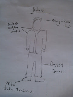
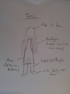
Our sitcom is based massively around the idea of stereotypes. We have found out that stereotypes are popular amongst our audience as it allows them to identify characters and therefore understand the narrative more easily. In our sitcom we have used the stereotypes of the 'geek' and the 'hot guy'. Like most other programmes, we have shown the 'geek' as being unpopular, slightly small, awkward and clumsy whilst the 'hot guy' is tall, attractive, cool and popular. We have also portrayed the 'geek' as someone who is interested in science and studying. This could be seen as quite a negative representation as not all people who study hard and enjoy science are unpopular and awkward.

If I was to apply my idea to a third media platform I would create a poster to coincide with the video and website. The poster will be displayed on billboards as well as in shopping centres, train stations, outside supermarkets etc. This would mean that it would be unavoidable and would be seen by a lot of people who would be intrigued by it and want to watch it. The poster would include an image of the cast members similar to the one included in the header and a chalk-like font which is also included in the website. This would show the audience that the theme of the sitcom was based around a school/college without going into too much detail. The poster would include the time and channel that the show will be on meaning they could glance at the poster and then know all the information they would need to be able to watch it. Most importantly the poster would include a twitter hashtag (e.g #Relations) to encourage the audience to participate in the social networking side of the programme. This would mean that people could get involved in conversations to do with 'Relations' and see what other people were saying about it. During my research into online media for television shows, I have found that by using hashtags, the shows gain more popularity. If the audience is encouraged to tweet during the show using a hashtag, then at the particular time the show is on, Twitter would be full of people all talking about the same thing. This may then intrigue people who don't normally watch that particular programme, to start watching it just to see what all the hype is about. In my opinion this is the best way to gain a wider audience.

Final Products


Website:
http://e4relations.wordpress.com/

Header Creation (New)


This was the original website header. We decided to change it as it did not match the conventions of other sitcom websites we had previously looked at. Most sitcom websites (such as the 'Fresh Meat' website and 'The Inbetweeners' website) use a photo of the cast in the header so we decided to create this on our own website.


I chose this image for the header background as it is similar to the background image on 'The Inbetweeners' website. The use of a chalkboard on The Inbetweeners website signifies education and shows the audience that the sitcom is set in a school. We decided that the use of a chalkboard in the header would be effective as it portrays our theme of school and 'geeky' students. We also thought that the chalkboard would contrast against the graffiti themed font, showing how trouble and rebellion often occurs in schools.


Website Production- YouTube and Facebook Links


By having Facebook and YouTube links on our page, we are allowing the users of our site to get involved. They can 'like, share and comment on our posts and videos which will make them feel part of our show. It also means they can share their views, showing us what our audience like/dislike about our show and allowing us to improve on it.

Website Production- Adding a Slideshow


As a group we created stills of our video in order to create some photos we can include on our website. I then uploaded these photos to our image gallery.


I then found a code, which I placed in the text on our homepage, that created a slideshow out of the images I had uploaded. When I looked at the slideshow I realised that the photos were not all the same size so I resized them in order to make the slideshow look more professional.

Having a slideshow on our website makes it look more aesthetically pleasing and gives the viewer something eye-catching to focus on. It also gives them a sneak-peek of our episode which may intrigue them into watching it.

Website Production

Alongside me, Georgie has also been involved with editing the website. She has added aspects to our website that are included in the website for 'The Inbetweeners' such as pop-art style photos and fun hyperlinks.

http://mediageorgie.blogspot.co.uk/2013/02/website-character-page-photo-editing.html

The involvement of these aspects make our website more conventional and will appeal to our target audience as they are used on a website for a sitcom that we know our target audience enjoy.

Audience Feedback (New)

By asking members of our target audience to share their views of our video and website, we have been able to asses what we need to improve upon. We have used our Facebook page to obtain our feedback as it means we are able to get a bigger spread of people's opinions. 

Charley and Georgie have written about our audience feedback on their blogs:

http://mediacharley.blogspot.co.uk/2013/02/post-production-audience-feedback.html
http://mediageorgie.blogspot.co.uk/2013/03/audience-website-feedback.html

Final Script (New)


This is a copy of the final script. We have had to edit it as the original one was far too long to fit into the two minute slot available. We also found that, at times, the dialogue was stilted and unrealistic so we edited it in order to create a better flow of conversation that the audience would be able to understand. We have also replaced the character of Jasper with Jess and needed to show this within the script.

Location Recce (New)

It was Charley's job to create the Location Recce. It was useful to have this before we started filming as it showed us how the lighting and sound would turn out in our video. It also meant that we were able to asses the amount of space we had for filming and what difficulties we would come across.

http://mediacharley.blogspot.co.uk/2012/12/planning-location-reece.html

Shot List (New)

For her role in pre-production, Georgie has created the shot list for our show. This is a particularly useful document as it meant we would know every shot we needed to film before we started, and therefore did not waste valuable filming time.

http://mediageorgie.blogspot.co.uk/2012/12/planning-pre-production.html

Costume Sketches

Sam has created some sketches of the costumes for each of our four characters:


These costume designs show that we have a range of stereotypes in our sitcom. This fits in with the conventions of sitcoms as all the sitcoms we have researched use very strong stereotypes. The idea of creating a 'geek' character is popular because it is used in a lot of well-known sitcoms and our target audience have said that they like 'geeky' characters.

Group Treatment (New)


Off-Campus Form (New)

As part of her role in pre-production, Charley has created an off-campus form. This makes us fully aware of all the risks we may come across and means we will be able to deal with any accidents sensibly.

http://mediacharley.blogspot.co.uk/2012/12/off-campus-form.html

Final Cut Pro Tutorial (New)

As we were struggling slightly with the editing of our programme, Charley has found a tutorial which shows us how to use thumbnails in Final Cut Pro. This is extremely helpful as it enables us to organise our clips and therefore find them more easily. The tutorial also covers changing the colours of a video clip which means we can correct the colours of a clip if it does not match the others. Therefore we are able to keep continuity in our show, making it look more professional.

Charley has uploaded the tutorial in her own post here:
http://mediacharley.blogspot.co.uk/2013/01/blog-post.html

Diagram of Website Structures (New)

In order to make our own website conventional and appeal to our target audience, I have looked at other websites aimed at the same demographic. From this I created a diagram showing the structure of the 'Inbetweeners' website and each page included.


Using this as a guide, I then created a diagram showing what our own website will include.


As you can see, we have included similar aspects from the 'Inbetweeners' website  in our own website. Like the 'Inbetweeners' website we have included character pages, as we already know that our target audience like to find out more about the characters in a sitcom. We have also included a 'Episodes' page where you can watch episodes of the programme. This is similar to being able to watch clips of  'The Inbetweeners' episodes on their videos page. The 'Interviews with Cast' page is included as we have discovered that our target audience like to watch behind-the-scenes videos of their favourite sitcoms. Interviews with cast members are also included on the 'Inbetweeners' website.

Wednesday, 27 February 2013

Website Header- Font Test (New)

As a group we decided that we would need a quite young and 'edgy' font as our website would be aimed at a young audience. Other websites we have previously researched that are aimed at a young audience (e.g. 'Fresh Meat' and 'The Inbetweeners')use fonts and colours that they would recognise and would therefore easily appeal to them. Due to this information, we decided on using a graffiti themed font. Graffiti connotes the idea of young people and rebellion (which would often take place in the setting of a college.) We then visited the site http://www.dafont.com/ and chose our favourite 5 fonts from there. Later Georgie showed these fonts to a selection of our target audience and asked them to vote which one was there favourite.

 The selection of fonts we chose are on Georgie's blog here: http://mediageorgie.blogspot.co.uk/2013/01/possible-fonts-used-for-website.html


 After showing the fonts to 16 students, 12 of them said that they liked the font '"Postinkantaja Job' the best. We will therefore use this font in our header because we have evidence to suggest that it appeals to our target audience. The 'stencilled' look of this font will be effective as the website for 'Fresh Meat' also uses a stencilled font. This shows that it works quite well on a website aimed at young people.


    Our chosen font

Individual Production Schedule (New)

Individual Production Schedule by

Photographic Storyboard (New)

Charley has created a photographic storyboard, as part of our planning, in order to test the scenes we had created before we filmed them. This made us realise that some of the shots lacked continuity or were ineffective. Because of this, we changed our shots in order to create a better flow. An example of this was when realised that a shot of Emily walking out of the library was unnecessary. Instead we cut straight to a scene of Emily outside the library, as the audience would have clearly been able to deduce how she got there without having to see it. By taking photos of the locations for the storyboard, we also got to check that the lighting would be effective. We found out that the locations we used had high-key lighting which would be suitable for a sitcom as it creates a happy, upbeat vibe. This is the link to the photographic storyboard on Charley's blog:

http://mediacharley.blogspot.co.uk/2012/12/planning-picture-storyboard.html

Original Storyboard (New)


We put together a simple hand-drawn storyboard to lay out our ideas for each shot before we moved on to create the photographic storyboard. This later became very helpful when deciding which shots we needed to move around or remove completely. We made various annotations to mark the shots we were keeping and put them in order so that our new photographic storyboard would be organised correctly.

 We each were involved in the creation of this storyboard and were assigned different shots to draw.